This is no longer the newest version, version 3.1.1 is the newest.
December 12, 2011.
Download DataGraph 3.0 for OS X 10.4 - Note that this is the latest version for 10.4
Once you have downloaded the new disk image, quit DataGraph, and overwrite the old version with the new version.
Version 3.0 has some major additions, and a lot of tweaks and incremental improvements. The UI is not changing, but is being streamlined.
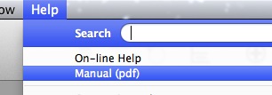
First off, a lot of work was put into creating a manual that was not on-line and can be printed. You can open up that pdf file from the Help menu. The on-line help is there, but is more of a reference manual.
Brand new features of 3.0
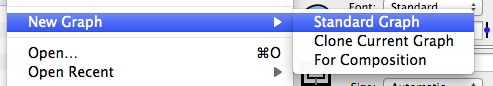
Multiple graphs
Multiple in a single DataGraph file. A popular request. You create a new graph by either clicking on the Add Graph icon in the toolbar or selecting it from the File menu
When a DataGraph file has multiple graphs, you will see a miniature version at the top of the window. The graph that you are working on has a thicker border, but changes to graphs are automatically updated in the thumbnails, for example if the data changes or you change a graph that is used in a different graph window.
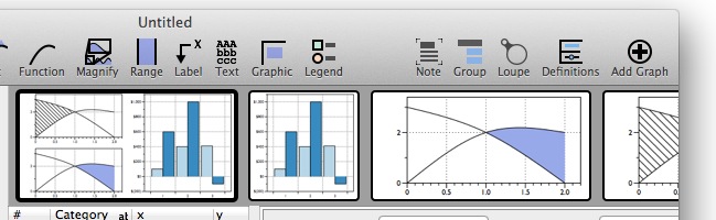
This can be used to create composite graphs or to just have multiple views of the same data. The composition is done by using the Graphic command. The Graphic command has been tweaked so that instead of just supporting pasted/imported graphics. Just select what the source is.
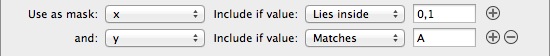
Multiple masks
Before a mask could only depend on a single variable. This meant that if you wanted to only include rows where “Col A” was between 0 and 1 and “Col B” was equal to “B” you had to do some expression column tricks. But now you can specify multiple mask lines. Just click on the small + button on the right side.
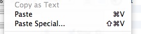
Paste Special
Next to the Paste command is the Paste Special command.
Useful when the default rules don’t do what you use the standard paste. For example, if you have a clipboard where the numbers are laid out in rows and not columns.
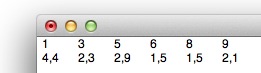
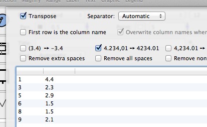
If you paste this in, what you will get is six columns with two rows. And on top of that, the numbers “4,4” will not be immediately understood and you need to do a search replace (in the Data menu) to fix them. Now you can both transpose and filter the data. When you select Paste Special, you get a sheet that gives you options for the paste and previews the result.
New column:
A new column called “From Command”
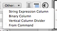
Here you can select a fit command and what column you want to get.
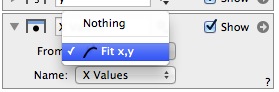
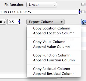
You can also create this column from the “Export Column” entry in the Fit command. This column will change when the fit changes. This for example will allow you to take the residual column and draw the distribution.
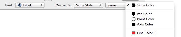
Improved Fonts
More commands now have a method to change the font, and the font color can now be selected from the color palette.
Tweaks and improvements for drawing commands.
Points
If you don’t select a column for x or y, you can specify a single number. That means that if you want a single point you don’t need to create two columns with only a single row in each one.
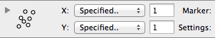
This also means that you can specify a single value for x and a column for y and get points that all have the same x coordinate.
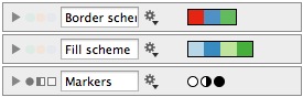
Before you could only vary the size and color (fill color or line color depending on point style), but now you can vary size, line color, fill color and marker type independently.
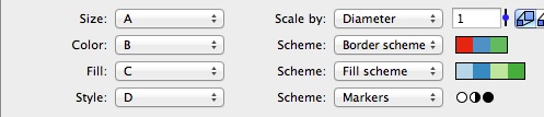
The rules to pick colors or markers are in the variable list, and the Marker variable is a new variable type.
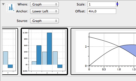
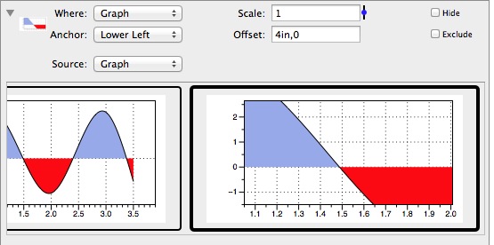
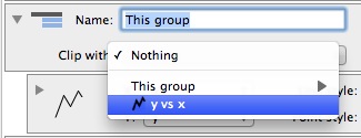
Graphic Command
The Graphic command is how to compose multiple graphs into a single figure. This is done through a new menu, the Source menu. Imported is the old method, and is used when the graphic is pasted in or coming from a file.
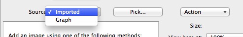
The Graph option changes the UI just below the menu and allows you to select from other graphs in the same DataGraph file. The positioning is the same. There is also a new position called “Figure” that allows you to position the graphic relative to the lower left corner of the figure, and not the axis.
Also added a transparency setting and support for importing QuickTime movies. For movies you get a time field where you can specify which time value to display.
Fit Command
LOESS now works better when you have data that consists of segments (x values are sorted) separated by spaces. In these cases, LOESS is used on each segment.
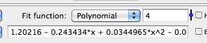
Added a “Polynomial” option for the fit function. This allows you to vary the order of the polynomial using a slider.
Added a weight column so you can use weighted least squares.
Added R2 - Coefficient of determination to all of the fit methods.
Easy to export the columns that are used for the fit, and the numerical values (described above)
Extra Axis
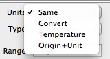
Added a method to specify a shifted coordinate system in the extra axis - http://www.visualdatatools.com/phpBB2/viewtopic.php?t=739. Called Origin+Unit. The Celcius/Farhenheit is a special case of this. Allows you to shift and scale the axis, not just scale it.
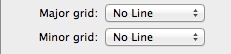
Added an option to tweak minor and major grid lines - http://www.visualdatatools.com/phpBB2/viewtopic.php?t=827
Plot
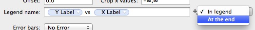
To label a plot, you can now draw the label at the end of the plot rather than in the legend. This is sometimes better when you have multiple plots.
Histogram
Added a method to allow you to overlay lines at specific percentages. For example 50% for median, and more generally 95%, 5% etc. You can specify a list of values from 0 to 1 (0.05, 0.5, 0.75, 0.95) and % is defined as a constant (=0.01) so 50% means 50*% = 0.5. Clip means that the lines are clipped by the histogram curve.
Label Command
Added alignment and rotation options for a label
Axis settings
Added a check box to force the scale in x and y directions to be the same. Works for both linear and logarithmic scales, but under some restrictions. Uses the padding “Nice Value” to add values to the ranges to keep the aspect ratio 1.
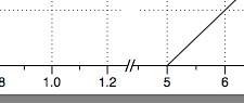
Added a method to support a break in the axis.
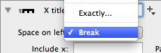
This puts a small break between the split axis.
Bar command
Added more flexibility for the pattern fill in the bars command. Before, the patterns were preset, but now you can tweak the pattern and background fill style.
Range Command
Added mask functionality. Only active when you select columns for intervals.
Can now choose to have the range not affect the axis range. This is useful when you want to use the range as a background.
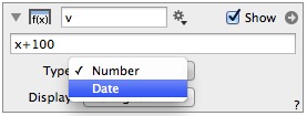
Expression column:
The main change is that you now have a menu that makes it explicit if the column should be viewed as a number column or date column. You also set how you want the value to be displayed.
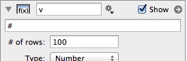
Another change is that before you always had a “minimum row” field called “At least … rows”. Now that field only pops up if the expression column can not deduce the length from the variables used in the expression. For example, the row number column (#) doesn’t have a length, so if you use that only, or use a global variable only, you need to specify how many rows to compute.
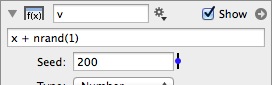
Similarly, if you use the nrand() function or or rand() function you need to specify the seed to the pseudo random number generator.
Added a new function - seconds. Takes 3-6 arguments seconds(year,month,day,hour,minute,seconds) and returns the number of seconds from Jan 1st 1970, like the date column requires. One use of this is to create a date based on columns, since the standard format yyyy:mm:dd:hh:mm:ss doesn’t work when y,m,d,h,m,s are not explicit numbers. That means that seconds(2000,4,14) = 2000:4:14.
Added a column property s.
Text Layout
The text layout has been tweaked and additional commands added. New commands are \hat and \tilde, for example \hat y.
Drawing command Group
Can now clip entries with a path coming from a plot or function. This was possible for the range and graphic commands, but this makes it possible to clip any command and multiple commands.
Crash fixes
There were fortunately not many of those. But a few were found and fixed. 3.0 was in beta for a very long time and should be even more stable than 2.3.2. If you ever run into a crash, please send in a report (feedback in the help menu).
Other:
Improved Cricket Graph data file import.
Adjusted the print panel so that you can turn the crop marks on/off.
Did some tweaks for Lion. Needed to adjust the scroll bar space (since the scroll bars are not visible) and the appearance of the color pop-up menu to fit with the new menu style.
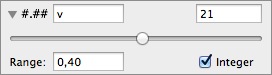
Added an “Integer” option for the variable slider.
Bug fixes:
Fixed a pretty bad error related to dragging around and deleting a group closer.
Fixed a dependency issue with expression columns.
Fixed a paste bug for columns. If no row was displayed and you pasted in a table, DG would overwrite expression columns and not just number/text/date columns.