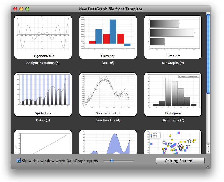
Below are a few of the templates that are included.
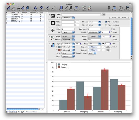
The first one is an example of the “Bars” command, which is the fifth icon from the left in the tool bar. One of the movie pages shows how to use that command. Note that you can set the error for each bar independently, and use different values for the positive and negative error.
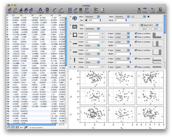
This is one of the scatter templates, and shows how to draw a matrix of plots. The x axis is same for each row in column, and the y axis is the same throughout each row. This is done by splitting the axis, and drawing a different scatter graph into each sub-axis.
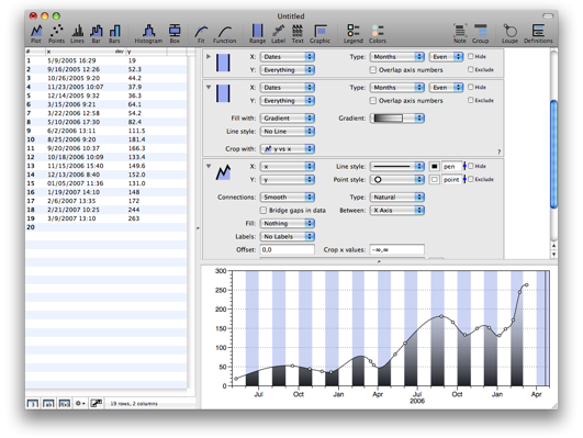
DataGraph supports calendar dates very well. Rather then trying to automatically detect if you are using a string/number/date, you create a date column, and specify the format exactly. DataGraph can suggest the format, and you can even specify your own so that DataGraph will understand strings like “Q1 97”, “Q2 97” as well as the standard formats. The axis tick marks automatically adapt, and as you zoom in, the tick marks are picked based on months, weeks, days, hours, minutes, seconds. Here the line connecting the points is a smooth curve.
Click here to go to the download page.
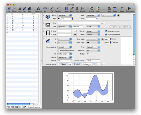
In some cases, for example when preparing a graph for publication, you need exact size control. You can specify the size of the graph exactly. In the example below the size is “5in,3in”. When you print from DataGraph you get small crop marks at the corners. When you export the image, the graphic has the size you specified.
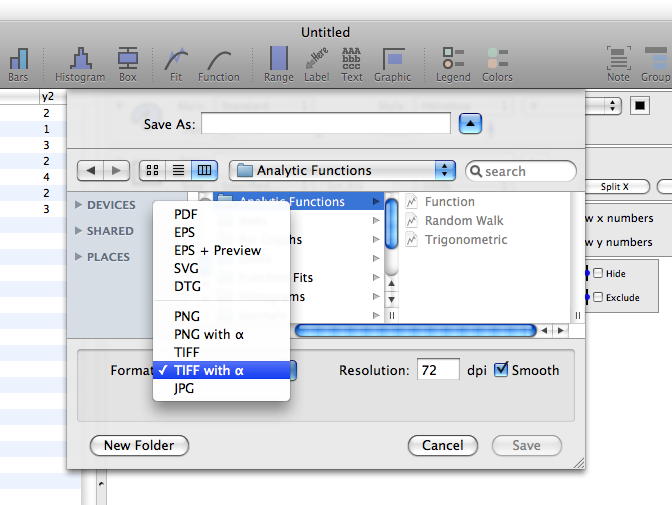
You can export to a variety of formats, both vector graphics and bitmap. For the bitmap you can specify the resolution and if the result should be anti-aliased.
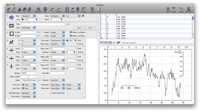
You can tweak the look of the graph by adding drawing commands. Some drawing commands take data from the table, others are intended to annotate the graph using text, arrows, regions or extra axis. The image below shows how to use the Axis command to add additional axis. These axis can be customized in various ways. You can specify a unit conversion, ranges, tick marks etc. Note that here the commands are on the left, and the data is above the graphic.
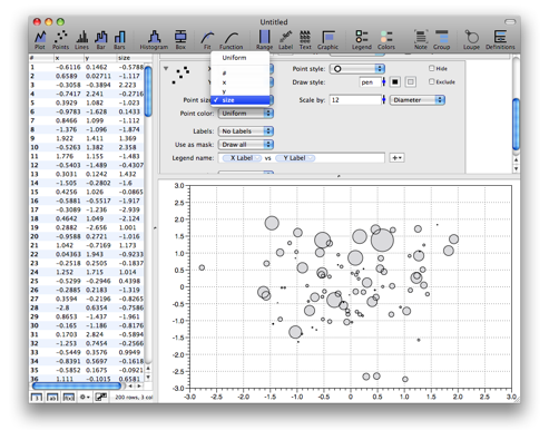
For a scatter graph, you can vary the size of the marker based on a column. This is typically called a bubble graph, but you can apply this to any type of marker, and either scale the area or the diameter.
Click here to go to the download page.